Friendly branding: should it stop?
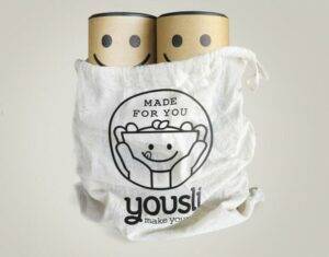
It is not very difficult to find examples or at least think about them. We have all met with some product that advertised what it was with enthusiasm. The mini bottle of gel in the hotel room that exclaims I'm soap, use me! The chocolate that is sold as a remedy for difficult days.You just have to think about any product and it is possible that somewhere someone has already tried to sell with that presentation to the friendly and nice, the nice. It is what is known as friendly branding. The product is presented in a fun and friendly packaging, one that is charming and friendly.
These types of designs have a clear explanation and justification. To the user, these products are more accessible and it is easier to establish a connection with them. For example, you just have to think about the Dropbox case. Dropbox is a product that, at first glance, does not look anything particularly accessible or especially nice. In the end, what we are selling is storage in the cloud, something that sounds like technology (it is) and not something easy to enter (it is also, especially now that we have all gotten used to using it on a recurring basis). How was Dropbox introduced? He did it with a look and feel that started with drawings that looked like handmade. It was friendly, it was close.
At a time when companies are obsessed with being close and showing a certain warmth to the consumer, friendly branding helps to position themselves in that field. Adult products are almost sold as children's products, with drawings, pleasing colors and fun and empathetic presentations. The presentation also makes everything seem more human, closer, which in an economic post-crisis market in which consumers have lost faith in corporations (and trust) makes much more sense.
All this has also been growing more and more and as more successful had these friendly and close proposals, more and more brands used. Everyone seemed to be entering into the friendly and charming, a kind of 'friendly' tide that basically stemmed from the proposition selling. In fact, the presence on the internet of companies has adapted so much to this that wherever you look at everything is a space of similar typefaces (human ...) and palettes of similar colors that makes one not really know where it is. It can be a fertilizer company or an emailing company and will have a similar look and feel.
At some point, it has to stop
But, of course, all this boom and all this excess of interest in the lovable, the friendly or the human (put the label on it) will have to end sometime.
It is not worth trying to be human and friendly if everyone is being equally human and friendly and the north is lost. To be exactly like the competition is hard, to have the same look and feel that the company that everyone considers the worst on the planet (but you want to reinvent) is worse.
As you can remember in the column, the friendly branding has, at the end, a dark area. The brands are using it to fill everything with optimism and warmth and are at the end perverting the message and even its own essence.
Add to that the brands do not look even new, but one more of the pile in the middle of a lot of equal companies.
And in the end, the friendly branding turned out to be friend-washing, a sort of friendly touch more fake than anything else that consumers are beginning to see with an even more critical eye.


